
Identity System Redesign: Strong National Museum of Play
Design Brief
This design project rebrands The Strong National Museum of Play.
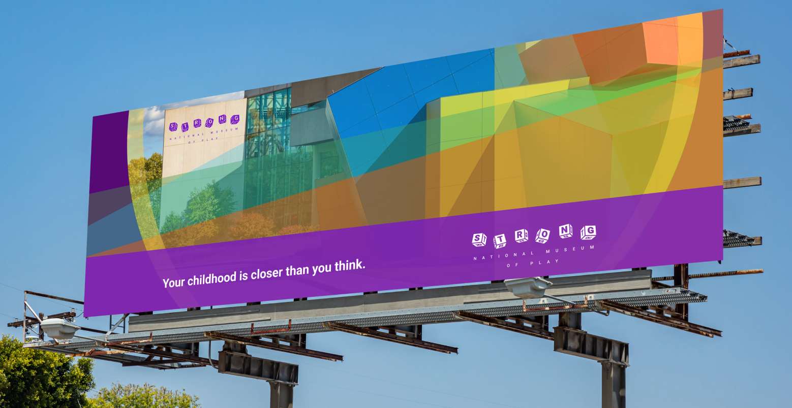
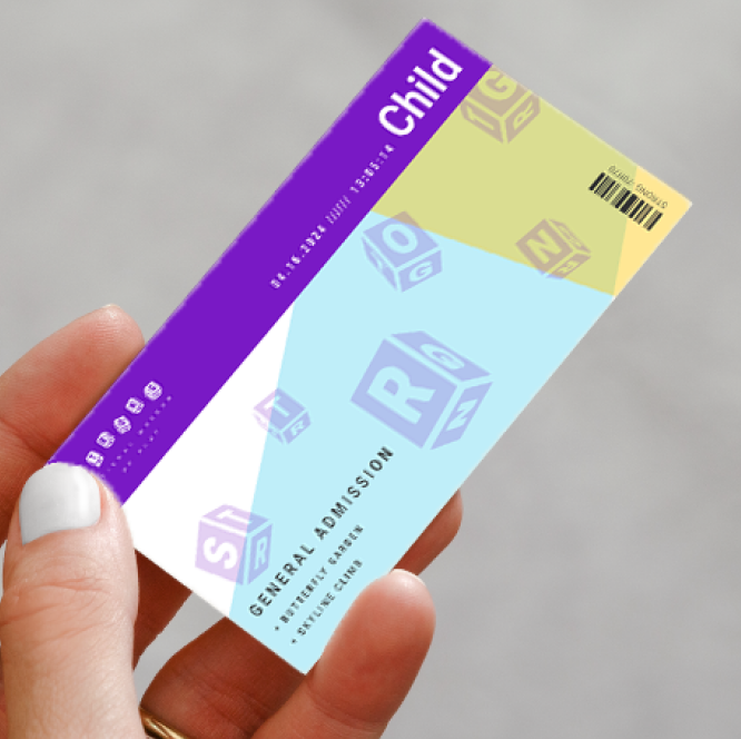
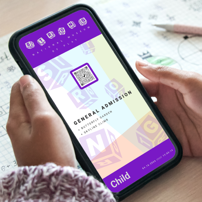
Deliverables include a redesigned website, a billboard ad, and physical and digital admission tickets.
Introduction
Brand Research
The Strong National Museum of Play’s mission is to explore how play fosters learning, creativity, and discovery, highlighting cultural history.
With its extensive toy collection, interactive exhibits, role as an innovation hub, and family-friendly environment, the museum embodies Swiss Psychiatrist Carl Jung's "Creator" brand archetype, emphasizing creativity and imagination.
These brand identity qualities are the guiding principles throughout the identity system redesign process.
Design Development
Rough Sketches
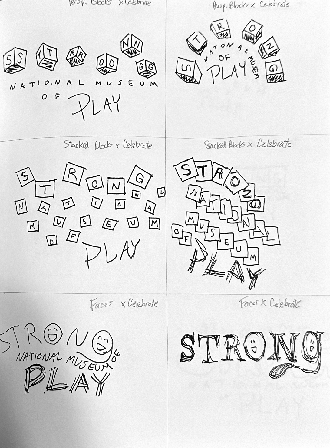
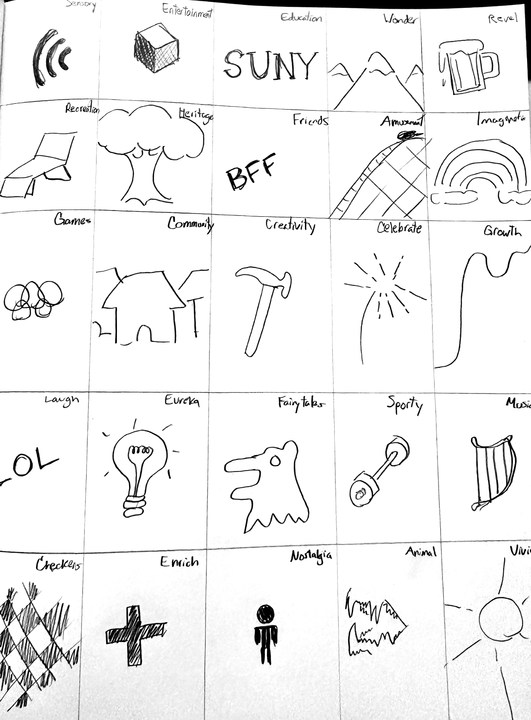
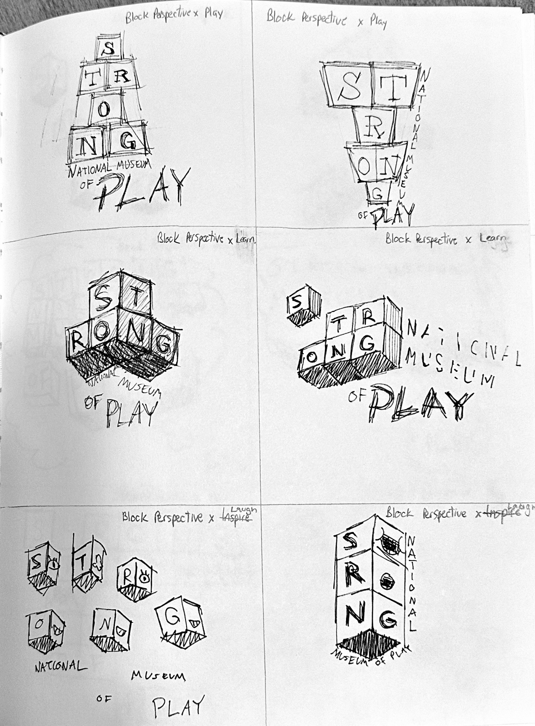
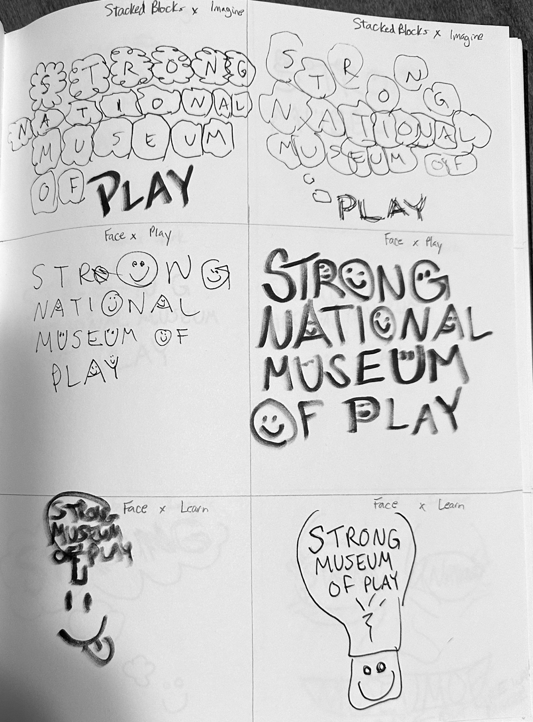
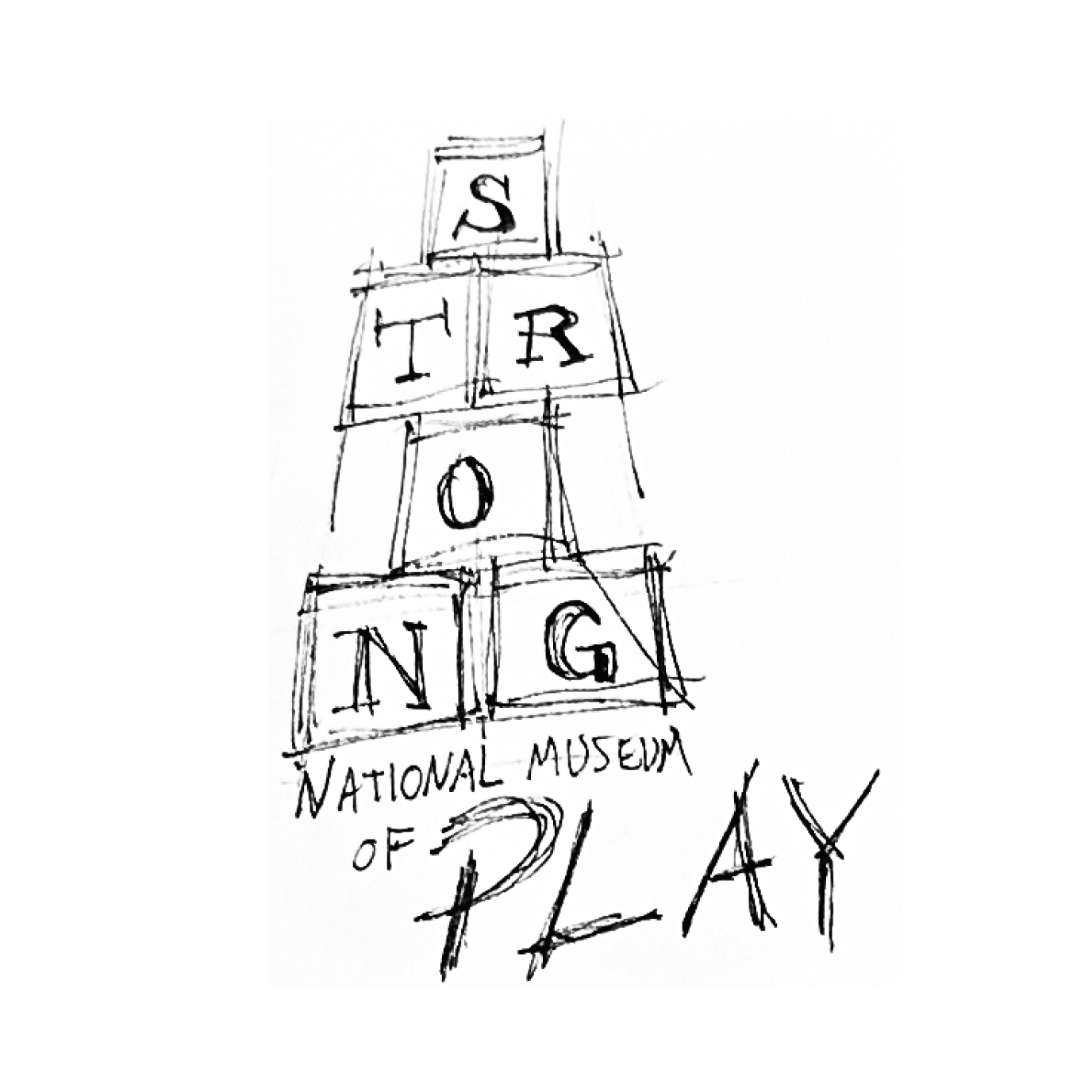
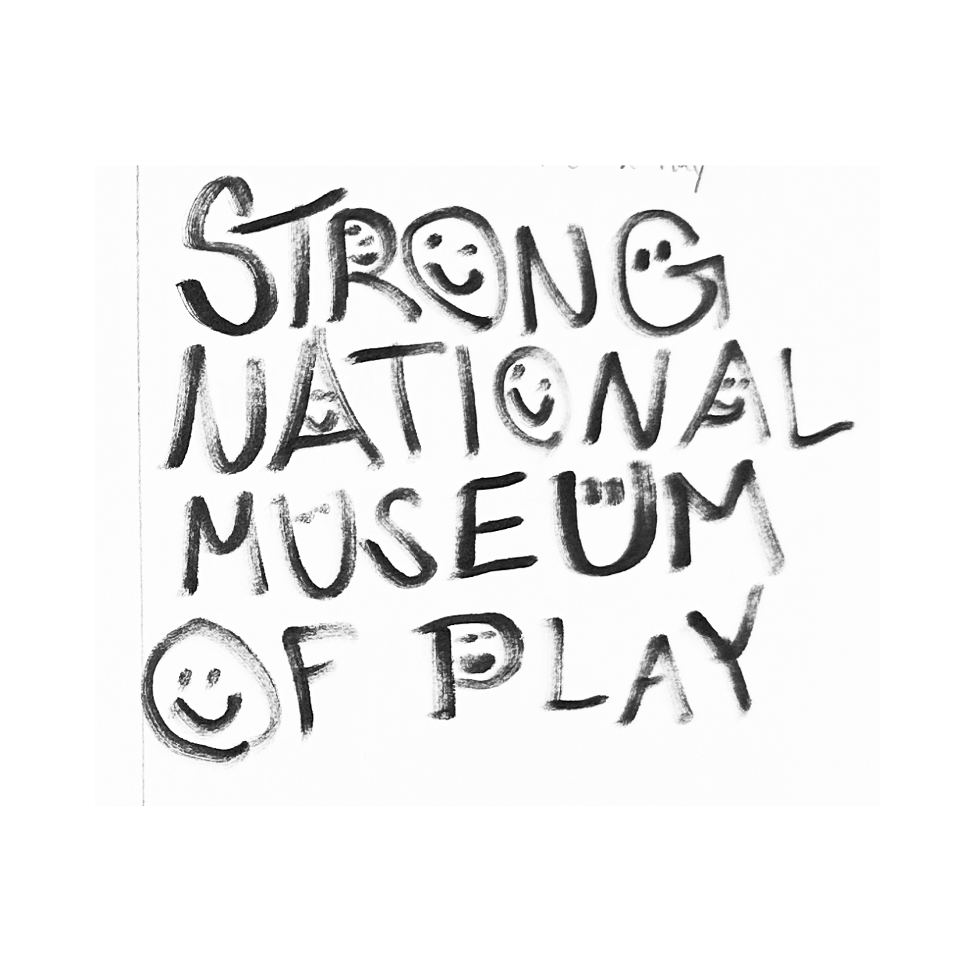
In this phase, my goal was to determine the logotype/logomark for my identity system redesign.
I drew inspiration from words deeply associated with the Strong National Museum of Play, such as "play," "celebrate," and "imagine."
After sketching over 100 ideas, I narrowed down the concepts to a select few.
These concepts featured various logomarks and logotypes related to the associated words.
First Round Vector Sketches
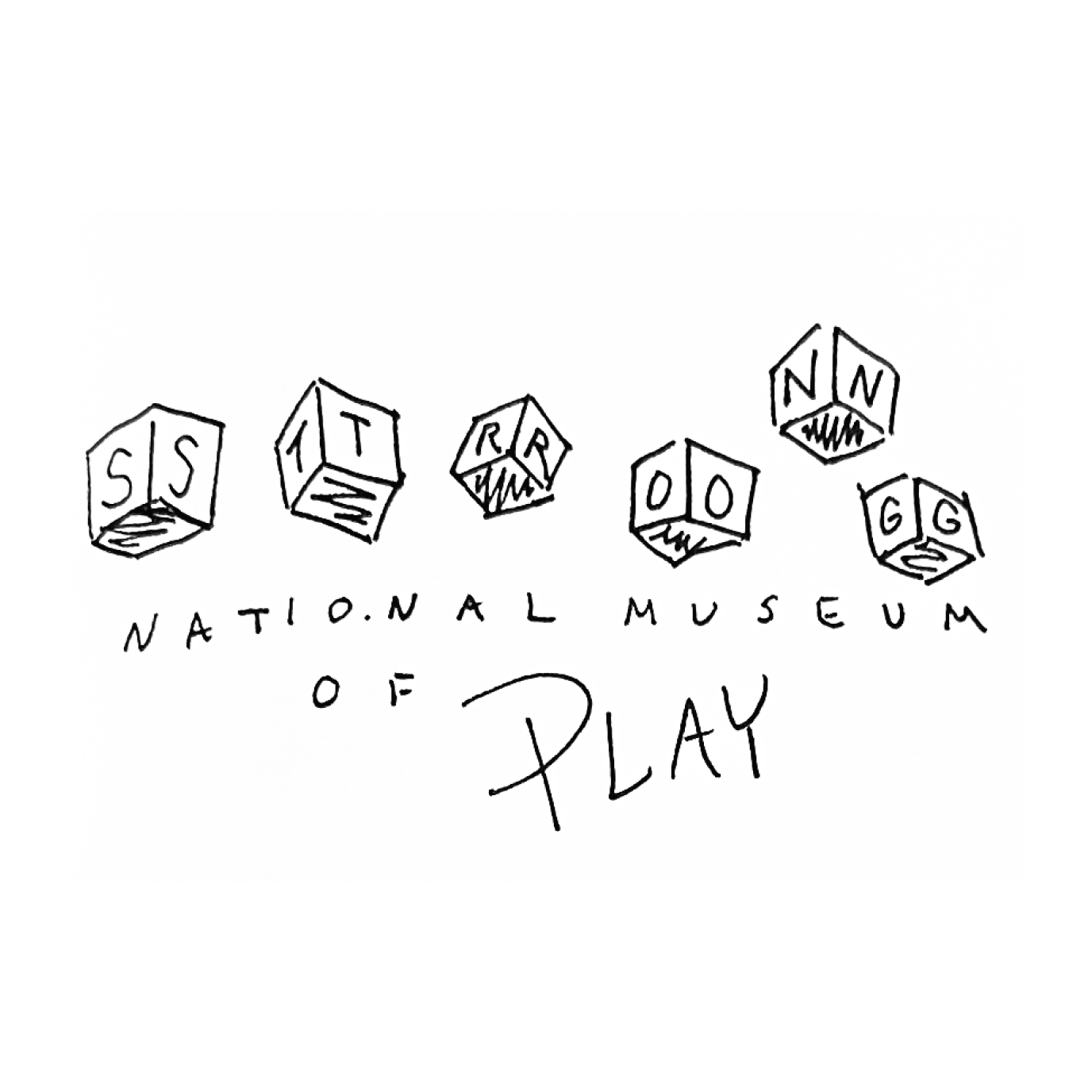
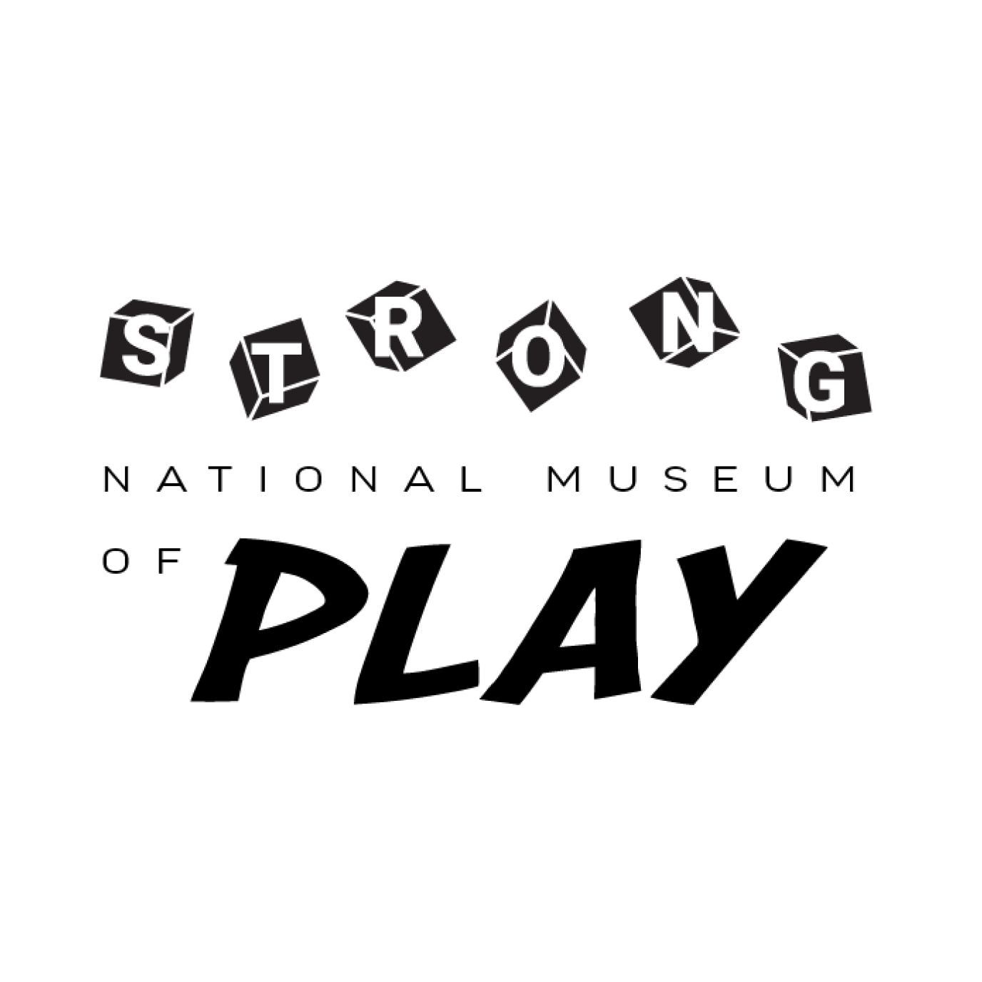
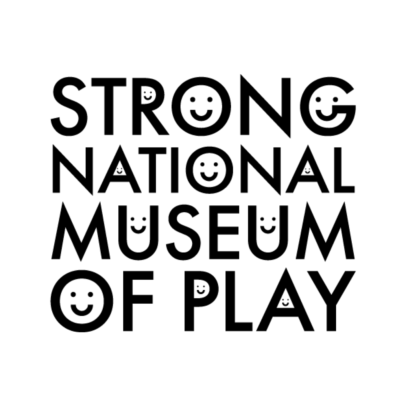
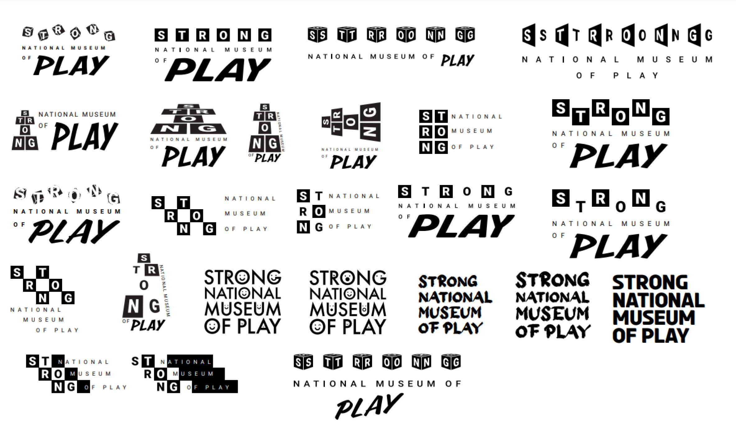
After selecting the most compelling ideas from the initial sketches, I created vectors to refine the logomark and logotype designs.

Second Round Vector Sketches
Using the three vector sketches from the previous round, I created dozens of iterations, exploring how different elements could enhance the logomark and logotype designs.
Third Round Vector Sketches
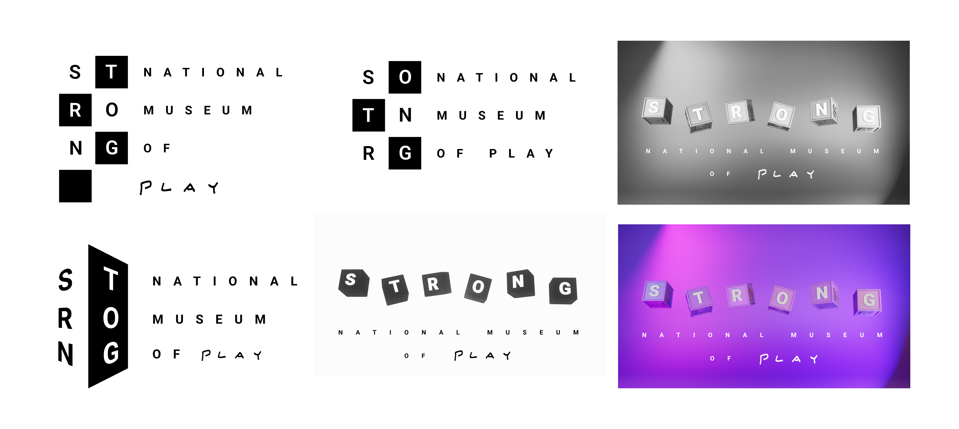
This round of revisions narrowed down what would potentially serve as the redesigned Strong National Museum of Play logotype/logomark.
Design Iterations
Final Logotype Design
For the final logotype, I chose a design featuring six blocks illustrated from a perspective, each with a letter from the word "STRONG." Below these blocks, "National Museum of Play" is spaced out to complete the logo.
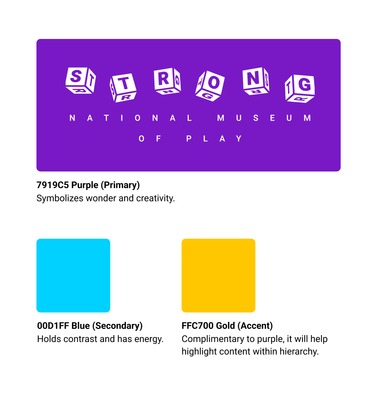
For the redesigned system's new colors, I chose purple for wonder and creativity, light blue for contrast and energy, and gold to complement purple and reinforce information hierarchy as needed in the design deliverables.
Rough Design Deliverables
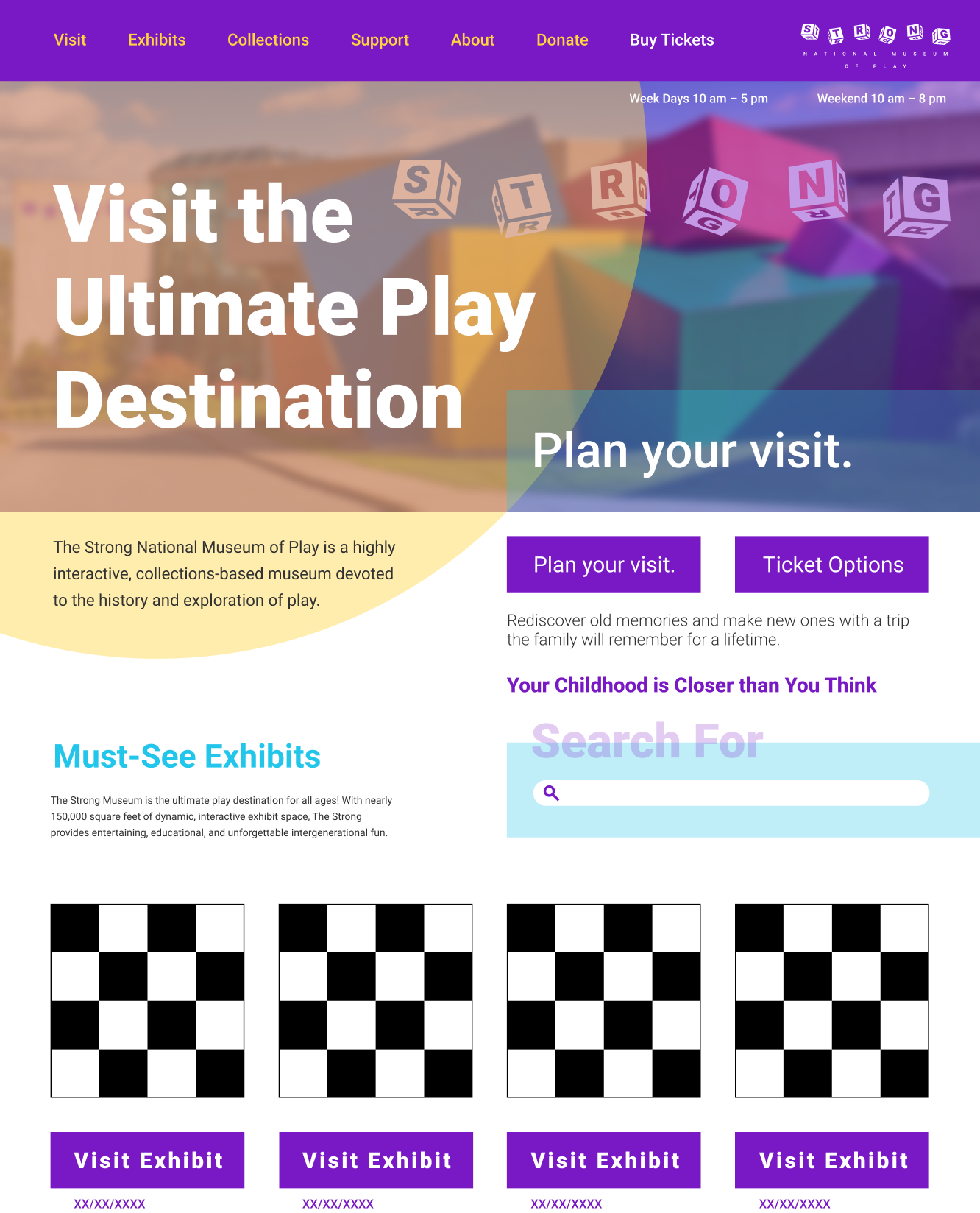
Once the logotype and color schemes were decided, I focused on creating rough designs for key deliverables: a billboard ad, website landing page, and ticket designs.
Drawing inspiration from toy blocks and the playful identity of The Strong Museum, as well as the architectural elements of the building, I utilized geometric shapes and vibrant colors.
Design Challenges
The landing page required restructuring of the type layout to improve information hierarchy, and I realized that I needed to more effectively integrate geometric shapes into the designs for greater impact.
There was too much information communicated on the billboard ad in addition to the geometric shapes applied with a heavy hand; overall it was too overwhelming visually.
Similar to the landing page, the ticket type layout needed readjusting for better hierarchy.
Website Landing Page Rough
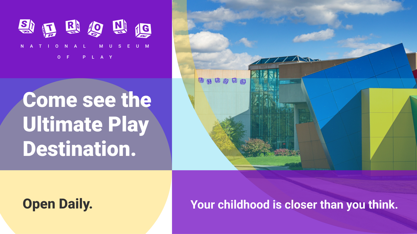
Biilboard Ad Rough
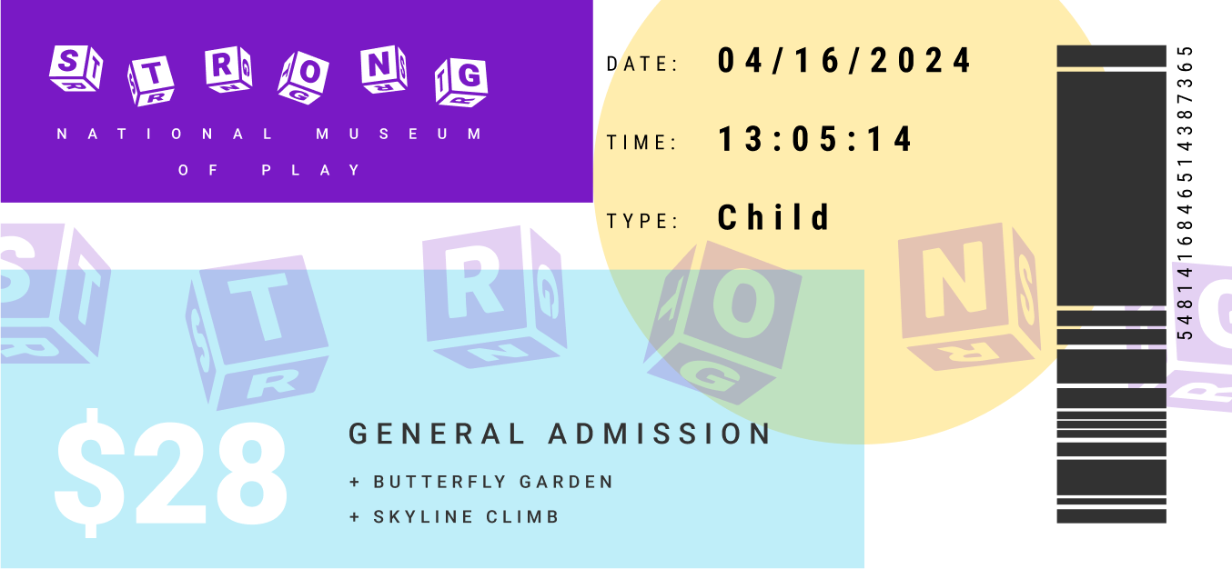
Admission Ticket Rough
Final Designs
Rendered Mockups
After addressing the design challenges from the rough design phase, I successfully implemented solutions to resolve these issues.
The landing page now features more geometric shapes that reflect the building's dynamic architecture, and a grid structure that enhances information hierarchy.
The billboard design uses less type and geometric shapes, resulting in a smoother, less overwhelming visual experience for the audience.
The ticket design's type layout was restructured, and using insights from these revisions, I created a digital ticket design that seamlessly fits within the new identity redesign system.


Conclusion
This project emphasized the importance of thorough research and iterative design. Extensive brand research ensured alignment with The Strong National Museum of Play's core values.
By addressing challenges and refining my work, I developed a visually engaging and functional identity system. Iterative sketching and vector refinement helped select the best concepts and improve design elements.
Ultimately, this process resulted in an identity system that reflects the playful and innovative spirit of The Strong National Museum of Play.
Mentions
Photographs of the Strong Museum building supplied by official website of the Strong National Museum of Play.
Mockup images and stock images supplied by Adobe Stock.